I’m sitting here, in the middle of the room along with the rest of this disappointed audience, and I can’t read a single thing on the presenter’s PowerPoint slides. Someone next to me whispers: “How big is that font, anyways? Size 6?” “It doesn’t matter,” I reply. “He’s just reading his slides word for word.”
When you present, you want your audience paying attention to you – not your slides. Your slides are there to support what you’re saying, not the other way around. They’re there to create an impact by arousing emotion, by communicating those thousand words you would never have time to verbalize yourself.
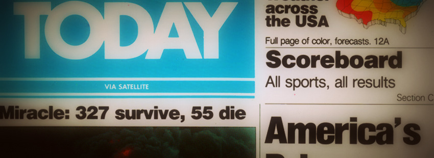
Why USA Today caused such a stir
When USA Today launched in 1982, people thought it was the death of journalism. The images took up more space in the newspaper than the words did! It was a drastic departure from the leading newspapers of the day. But despite the prediction of doom, in only four years, USA Today had gained the second largest readership in America, and in six more years, it was number one. It’s still number one to this day [1]. Why? Because images are so much more compelling than printed words. They attract, and keep, your attention, helping you to remember the story long after you’ve absorbed the information.
How to find the right image
Finding the right image to accompany part of your speech (or any other content you create) can be tricky. It’s not always obvious what image you should use to support what you’re saying. It takes some creativity and an ability to translate the meaning of your text into keywords you can use to run a relevant image search. Don’t try to be too literal. Not only are literal images hard to find, but you miss the opportunity of elaborating, in a real and visceral way, the underlying message of your story. Therefore, it helps to think of the entire context when looking for visuals. For example, if you are trying to convey a concept that doesn’t elicit a literal image, such as, say, the importance of harmonized regulations between Canada and the U.S., try drawing on a particular aspect of the story instead. You could show an image of a freight truck sitting at the Canada-U.S. border, and you could create immediate relevancy by mentioning how truckers inconveniently need to change their tires dozens of times when transporting goods across different borders in order to comply with regulations in various jurisdictions. Don’t just write this information out as a bullet point on your slide. Show your audience something that will stick in their minds.
When you’re giving a presentation, you want your visuals to support and emphasize what you’re saying, not the other way around. If you have a lot of text on your screen, your listeners end up spending more time reading your slides than listening to you. So when you create your slides, use as little text as possible. If you absolutely have to use text, keep it simple and use a 20pt font or more. Again, when you’re creating your slides, keep in mind: less is more.
[1] Reference: John Medina, Brain Rules
Feature image credit: David Folkerson
 Senior communicator | Team leader | Web and social media expert | Strategist.
I love making new professional acquaintances. Reach out if you want to talk communications, marketing, or ultimate frisbee.
Senior communicator | Team leader | Web and social media expert | Strategist.
I love making new professional acquaintances. Reach out if you want to talk communications, marketing, or ultimate frisbee.


Join the conversation